ShopDreamUp AI ArtDreamUp
Deviation Actions
![[OPEN] - Dragon- (91)](https://images-wixmp-ed30a86b8c4ca887773594c2.wixmp.com/f/85402926-1786-47c5-aa82-d6f2e29275dd/dgolyjb-e188429a-e724-45e7-a66e-60088765faf8.jpg/v1/fill/w_311,h_400,q_70,strp/_open____dragon___91__by_dnataoai_dgolyjb-400t.jpg?token=eyJ0eXAiOiJKV1QiLCJhbGciOiJIUzI1NiJ9.eyJzdWIiOiJ1cm46YXBwOjdlMGQxODg5ODIyNjQzNzNhNWYwZDQxNWVhMGQyNmUwIiwiaXNzIjoidXJuOmFwcDo3ZTBkMTg4OTgyMjY0MzczYTVmMGQ0MTVlYTBkMjZlMCIsIm9iaiI6W1t7InBhdGgiOiJcL2ZcLzg1NDAyOTI2LTE3ODYtNDdjNS1hYTgyLWQ2ZjJlMjkyNzVkZFwvZGdvbHlqYi1lMTg4NDI5YS1lNzI0LTQ1ZTctYTY2ZS02MDA4ODc2NWZhZjguanBnIiwiaGVpZ2h0IjoiPD0xMDI5Iiwid2lkdGgiOiI8PTgwMCJ9XV0sImF1ZCI6WyJ1cm46c2VydmljZTppbWFnZS53YXRlcm1hcmsiXSwid21rIjp7InBhdGgiOiJcL3dtXC84NTQwMjkyNi0xNzg2LTQ3YzUtYWE4Mi1kNmYyZTI5Mjc1ZGRcL2RuYXRhb2FpLTQucG5nIiwib3BhY2l0eSI6OTUsInByb3BvcnRpb25zIjowLjQ1LCJncmF2aXR5IjoiY2VudGVyIn19.8RQ6NhwqEaR9hBHDHQxeRMwlQn8R_yohgEh2k8mSojA)


Suggested Deviants


Suggested Collections


You Might Like…


Featured in Groups


Description
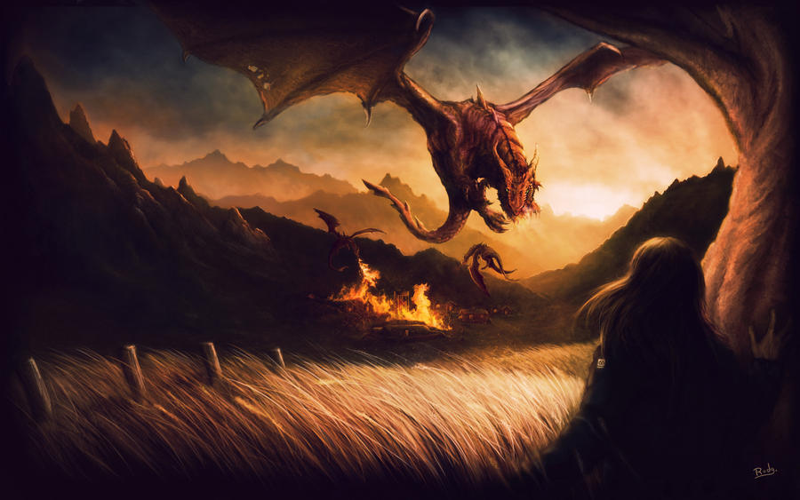
That's a illustration for a spreading site of a trilogy book writing by Mario Henrique Prado, call of: Sagas de Hartvellir - A Guerra dos Dragões. The web site: [link]
I spent about one week in this paint and use some references...
Hope u like! ^^
-----
Essa é uma ilustração feita para o site de divulgação da trilogia escrita por Mário Henrique Prado chamada: Sagas de Hartvellir - A Guerra dos Dragões. Site: [link]
Eu gastei por volta de 1 semana nessa ilustração e usei algumas referencias..
Espero que gostem! ^^
Image size
2560x1600px 2.71 MB
© 2010 - 2024 rodg-art
Comments303
Join the community to add your comment. Already a deviant? Log In
This is my first critique so don't take it too seriously <img src="e.deviantart.net/emoticons/n/n…" width="20" height="21" alt="
The first thing that attracted me to this picture was your use of colours and contrasts, I love how rich it all seems. The oranges contrast very nicely with the blacks, it helps evoke that feeling of an ancient world, fire and destruction.
At first I didn't notice the other two dragons that are slightly further away, especially the one on the left, maybe a bit more of a highlight on the bottom to bring it out just a tad more would have been great.
The tree in the foreground to me doesn't really look like a tree, maybe some leafs or an extension of the branches would have helped that a bit more, but I guess its not really that important as the focus is on the dragon and the burning village, which I think you pulled off nicely.
The fact that the grass looks like grass, which could only have been accomplished by painting each blade individually is fantastic. Also, the fact that you decided to put more "action" on the right hand side of the picture is great as my eye travels across the picture (nice use of the poles to do that), bringing the whole meaning of the picture into position at the right time, not too quick and too sudden like some people do, so nicely done on that.
Also your background mountains are done nicely as they just compliment the foreground without drawing any attention away from your focal points. Speaking of focal points, your main dragon is done very nicely, with its head tilted towards the person standing in the bottom right hand corner/viewer I get the impression that its heading straight for me which gives it that menacing appeal.
Overall I'd say well done, everything is in harmony with everything else <img src="e.deviantart.net/emoticons/c/c…" width="20" height="20" alt="